© 2026 WayneArc
MED44 | ARCADIA
Med44 began as a small, overlooked corner residence that was ultimately transformed into a full commercial space for a medical esthetics practice. The design intent centered on creating a refined and luxurious presence along the streetfront while maintaining a sense of lightness and intrigue.

Working closely with the client, the project expanded beyond architecture and into a comprehensive design process. In addition to developing the exterior concept and interior schematics, we were able to design the brand identity, logo, signage, stationery, social media templates, and supporting product designs. Each element was developed in parallel to ensure the physical space and visual identity functioned as a cohesive experience.
PROJECT TYPE:
Commercial Architecture | Branding Design
YEARS:
2022 - 2024
IN COLLABORATION WITH:
Architect - Linnea Brudenell, AIA.
Interiors - Kaitlyn Wolfe, ASID
Site Permitting - Threaded Studios, PLCC
Contractor - Green Elephant Development, LLC
Signage Consultant - Airpark Signs & Graphics
PHASES INVOLVED:
Schematic Design
Design Development
Construction Documentation
Interior Design
Branding Design
PRE-DESIGN
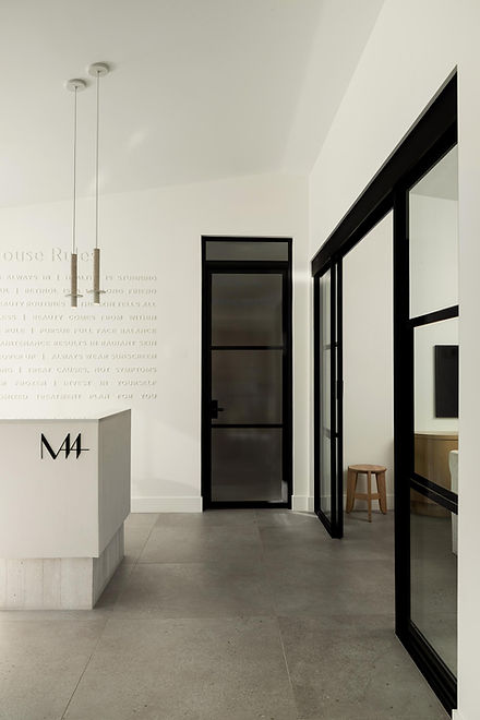
Architecturally, the space was designed to support the daily operations of a medical esthetics practice while maintaining an atmosphere of luxury and privacy. The plan includes four patient treatment rooms and a dual function office and rest space for the client and her team. Public-facing areas include a reception space paired with an adjacent product “experience” area, allowing clients to visit solely to explore and purchase products in a more casual retail interaction. A generously sized ADA-compliant restroom ensures accessibility and comfort for all visitors, too.
Design-wise, the client wanted to insure the vision for the building translated into the products provided, too. Hence, we began additional scope for the Med44 logo; including branding, signage, paper goods, and beyond.

"The design prioritized maintaining the neighborhood’s residential scale while thoughtfully adapting and reusing as much of the existing structure as possible."
DESIGN DEVELOPMENT
As the project moved into Design Development, the initial concepts were refined in response to cost, accessibility, and client feedback.
While this earlier scheme incorporated extensive exterior stone elements and sculpted concrete forms, these features were evaluated for constructability and budget. The design was adjusted by reducing the number of stone “folly” walls and simplifying several concrete hardscape elements, which also improved ADA accessibility throughout the site. The exterior color was revised to incorporate black, allowing the building to stand out clearly from the street.
Small, yet impactful elements were kept. One particular element were the steel bent-plate header projections, which were preserved as a defining architectural element that translated the overall quality of the Med44 brand.

EARLY SITE & DESIGN IMAGES


SIGNAGE & BRANDING
Signage and branding were integrated early as part of the building’s experiential design, and it was a pleasure to be able to work with Airpark Signage to translate the design to reality.
Black steel lettering floating slightly off the stucco façade, casting a soft shadow that adds depth and visibility along the street. Messages such as “Welcome Back” reinforce the brand’s warm, confident identity—suggesting that even a first-time visitor is already part of a returning experience.
Even the House Rules, elegantly shadowed in whisper white reinforce the quality, detail and attentive care of the Med44 brand.